Logo & Wordmark
Primary - Light Background
Use this version on white or light backgrounds.
Primary - Dark Background
Use this version on dark or brand-colored backgrounds.
Monochrome - Black
For black and white print or single-color applications.
Monochrome - White
For dark backgrounds where color is not permitted.
Audience
Inclusive Mission Statement
Re:Wear Hudson Valley is a guide to sustainable shopping, clothing repair, and slow fashion resources in the Hudson Valley, built for everyone in our community regardless of budget, background, age, or ability. Our audience includes first-time thrifters, budget-conscious shoppers, seasoned slow-fashion advocates, and local repair artisans. We share information in plain, approachable language so that sustainable fashion never feels intimidating or out of reach, and we highlight resources across a wide range of price points so that low-income shoppers are always part of the conversation. Our digital content is designed to be accessible for users with visual, cognitive, or motor impairments, and we aim to reflect the full diversity of Hudson Valley residents in our language and imagery, including older adults, non-English speakers, and people who are brand new to slow fashion. We believe that when sustainable shopping knowledge is shared freely and openly, making better choices becomes second nature for all of us.
Audience Considerations
- Visual Disabilities: Some users cannot see small or low-contrast text clearly. All text must have enough contrast against its background to be easy to read. Images need descriptive alt text so screen readers can describe them out loud. Text should be able to grow larger when a user zooms in without the page breaking. Avoid using color as the only way to share information
- Cognitive Disabilities: Some users find it hard to process large amounts of text or complicated instructions. Keep sentences short and use simple, everyday words. Break content into small chunks with clear headings so it is easy to scan. Use the same words and layouts consistently across pages so nothing feels surprising or confusing. Avoid blinking animations, auto-playing content, or anything that moves on its own, as these can be distracting or overwhelming
- Audio Disabilities: Some users cannot hear audio or video content. All videos must include accurate closed captions that are timed to match what is being said. Any important information shared in audio format must also be available as written text. Do not rely on sound alone to alert users to something important, such as an error or a confirmation message. Always pair audio cues with a visible text or visual signal.
Voice & Language
Plain Language Guidelines
[Describe the target reading level and general tone of the brand. Provide guidelines on jargon, complex sentence structures, etc.]
| Do Say (Inclusive/Plain) | Don't Say (Exclusionary/Idiom) |
|---|---|
| Re:Wear Hudson Valley is a guide to buying secondhand, repairing clothes, and finding sustainable fashion in the Hudson Valley. We want to make it easy to shop local and slow — so conscious shopping becomes a habit. When we take care of what we own, we buy less and waste less. | Re:Wear Hudson Valley is a guide to shopping sustainably, repairing clothing, and finding sustainable fashion resources in the Hudson Valley. The goal of Re:Wear Hudson Valley is to make accessible the knowledge of local slow fashion resources, and for conscious shopping to become second nature. When we truly value what we own, we start to make better purchasing choices, which naturally reduces both consumption and waste. |
| How do we make sustainable fashion the easy choice? We value our clothes, find local options, and build a community that chooses quality over disposable fashion. | How do we make sustainable fashion the easy choice? We can do this by valuing our clothing, finding sustainable options nearby, and building a community that shifts from disposable wardrobes to intentional, lasting ones. |
Colors
Brand Palette
Color Usage Policy
Use of Color: Color should never be the only way we share important information with our audience. Some of our users are colorblind, have low vision, or use screens that show color differently, so if we rely on color alone, some people will miss key information entirely. For example, if a form field turns red to show an error, always pair that with a written message like "This field is required" so the meaning is clear to everyone. The same goes for links in body text, which should always be underlined or labeled, not just colored differently.
A good rule of thumb is to ask yourself: if this design were printed in black and white, would the meaning still be clear? If the answer is no, add a written label or icon to support the color so that every Re:Wear user gets the same experience regardless of how they see color.
Text Contrast Playground
According to WCAG 2.1 AA standards, normal text (smaller than 18pt or 14pt bold) requires a minimum contrast ratio of 4.5:1 against its background. Large text (18pt and above, or 14pt bold and above) requires a minimum contrast ratio of 3:1. Meeting these standards ensures that your content is readable for people with low vision or color blindness. The tool below lets you check whether your brand colors meet these requirements. Enter your text color and background color to instantly see your contrast ratio and whether it passes or fails WCAG 2.1 AA standards. Use it to test any color combination you plan to use on your website, printed materials, or social graphics so that Re:Wear Hudson Valley content is easy to read for everyone in your community.
Preview Text
The quick brown fox jumps over the lazy dog.
Contrast Ratio:
| Standard | Normal Text | Large Text (18pt+ / 14pt bold) |
|---|---|---|
| WCAG AA | ||
| WCAG AAA |
Negative Examples
The following examples illustrate color combinations that fail WCAG AA compliance due to insufficient contrast.
Do Not Use
Light gray text on white background (Fails WCAG AA)
Do Not Use
Black text on dark gray background (Poor visibility)
Non-Text Contrast (UI Elements)
According to WCAG 2.1 AA standards, interactive components such as buttons, input field borders, and icons require a minimum contrast ratio of 3:1 against their adjacent background colors. This applies to the visual boundary or indicator that identifies the component, meaning the border or outline of a button or text input needs to be distinguishable from the background around it. This ensures that users with low vision can identify where to click, tap, or type without relying on color alone. Note that this standard applies to the component's boundary against its background, not the text inside the component, which still follows the 4.5:1 rule for normal text.
Inline Links
All inline links within body content must be clearly identifiable without relying on color alone. Links should stand out from surrounding text so that every user, including those with low vision or color blindness, can spot them easily.
- Text Decoration: All inline links must be underlined at all times, including in their default, hover, and focus states. Underlining is the most universally recognized signal that text is clickable and ensures links are distinguishable from regular body text by more than just color alone.
- Color Contrast: All link text must meet a minimum contrast ratio of 4.5:1 against its background color.
- Hover & Focus: When a user hovers over a link with their mouse, the link color must shift to the Re:Wear primary maroon to signal interactivity. When a user navigates to a link using a keyboard or assistive technology, a light blue focus ring must appear visibly around the link so keyboard users always know where they are on the page.
Typography
Typeface Selection
Primary Typeface: Alexandria
Secondary Typeface: Riant Display
Readability Standards
- Line Height: Body text must have a line height of at least 1.5 to ensure readability.
- Paragraph Spacing: Spacing between paragraphs must be at least 2 times the font size.
- Alignment: All body text must be left-aligned. Left-aligned text is easier to read because the eye always returns to the same starting point at the left margin. Centered or right-aligned text should only be used for headings and subheadings. Never use justified text, where words are stretched to fill the full width of a line, as the uneven spacing between words can make reading harder for users with dyslexia or cognitive disabilities.
- Capitalization: All caps text should only be used for short, attention-grabbing headings in social media posts. Never use all caps for body text, captions, or long strings of words, as all caps removes the natural shape of words and makes text significantly harder to read, especially for users with dyslexia or low vision. For emphasis within body text, use bold instead of all caps.
Hierarchy Preview
Heading 1 (H1) - 60pt / Bold
Heading 2 (H2) - 36pt / Bold
Heading 3 (H3) - 22pt / Bold
Body Paragraph - 18pt / Regular
This demonstrates how the standard reading text will look.
Re‑Wear is a local resource for finding sustainable fashion options in the Hudson Valley connecting people with shops, repair services, and community initiatives that keep clothing in circulation.
Imagery
Multimedia Policies
- Text in Images: Avoid embedding text directly into images whenever possible. Text inside an image cannot be resized, translated, or read by a screen reader, which makes it inaccessible to many users. Always render text in code so it can be scaled, selected, and read by assistive technology. If text must appear inside an image, for example in a promotional graphic or social media post, the same text must also appear as a visible caption or in the alt text of the image so no information is lost.
- Video & Audio: All Re:Wear videos must include accurate closed captions that are timed to match the spoken content and include descriptions of any important background sounds. Any content that is shared in audio-only format must also be available as a written transcript. Transcripts should be posted alongside the audio file, not hidden behind an extra click or link.
- Motion Control: Do not use flashing or strobing visuals in any Re:Wear content, as these can trigger seizures in users with photosensitive epilepsy. Avoid auto-playing video or audio without user consent. Animations and moving elements should be subtle and purposeful, and any animation that lasts longer than five seconds must include a way for the user to pause, stop, or hide it. Always follow the reduced motion preference setting, meaning if a user has turned off animations on their device, Re:Wear content should respect that setting and display a still version instead.
Alt-Text Style Guide
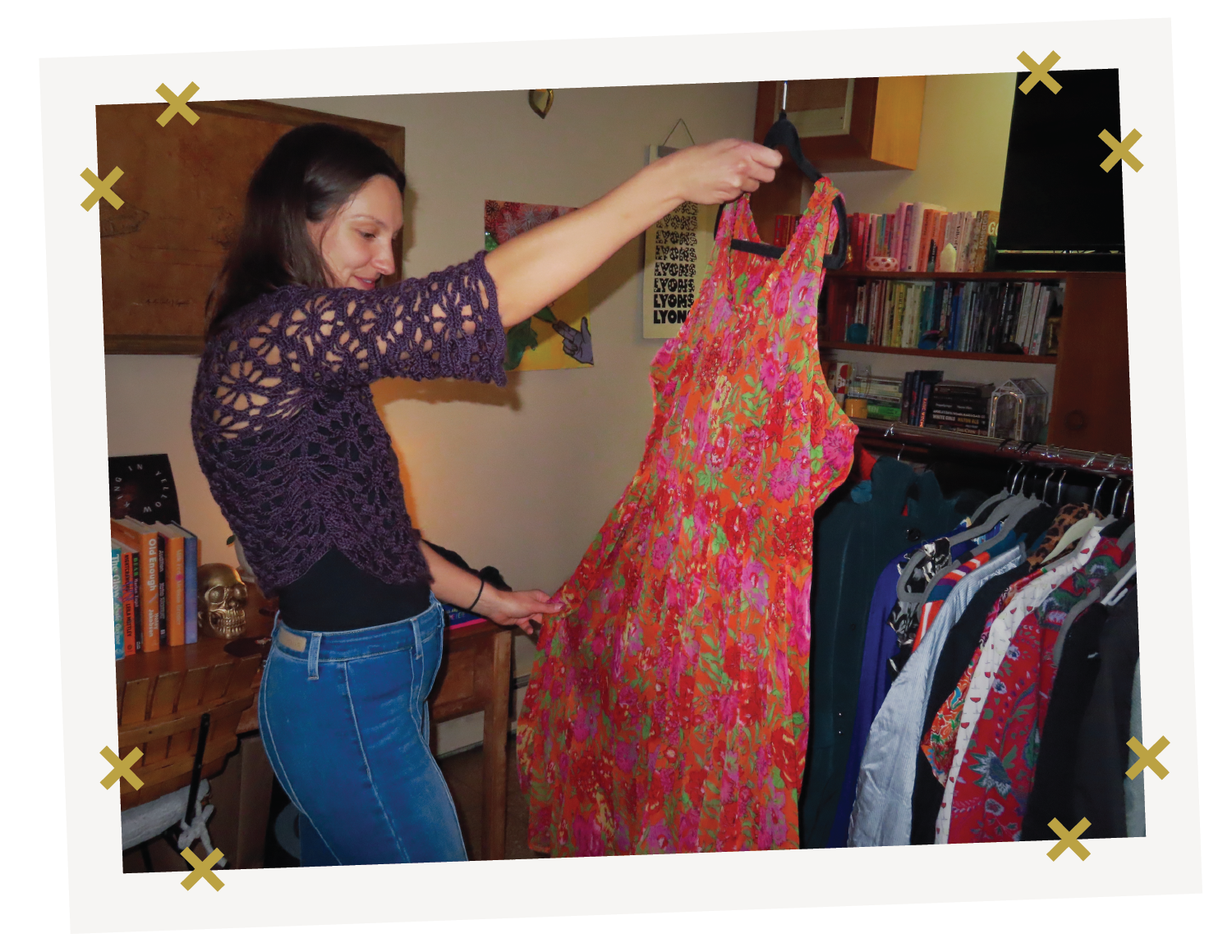
Alt-Text: "A woman holds up a bright red and pink floral dress at a clothing swap. A rack of secondhand clothes stands behind her."

Alt-Text: "A view from above of a lake and fall forest in the Hudson Valley, with a gold thread and needle illustration layered over the photo."
UX & Content Design
Visual UI States
Text Links
Links must be distinguishable by more than just color. Default: Underlined.
This is a paragraph containing a text link to demonstrate the default state.
Button States
Buttons must have a highly visible focus indicator (e.g., outline) for keyboard navigation.
Touch Targets
Interactive elements must have a target size of at least 44x44 CSS pixels to accommodate touch inputs.
Structure & Semantics
- Form Labels: Every form field must have a visible label placed above the input box. Labels must always stay visible, even after a user clicks into the field and starts typing. Placeholder text, which is the gray hint text that appears inside a field before you type, can be used as an extra hint but must never be used as a replacement for a label.
- Heading Structure: Every page must have one H1 that tells the user what the page is about. Use H2 for the main sections on that page, and H3 for any subsections within those. Never skip a level, for example do not jump from an H2 directly to an H4, as this can confuse screen readers and make the page harder to navigate. Do not use heading tags just to make text look bigger or bold. Headings should only be used to organize content, not for visual styling. If you need text to stand out without it being a real section heading, use bold or a styled paragraph instead.
Implementation
Approved Accessibility Tools
- WebAIM Contrast Checker - Use this to check that your text and UI component color combinations meet WCAG 2.1 AA contrast ratio requirements before publishing any digital asset.
- WAVE Web Accessibility Evaluation Tool - Use this to scan any Re:Wear webpage or digital content for accessibility errors, including missing alt text, poor heading structure, and low contrast issues.
- NVDA Screen Reader - Use this free screen reader to test how Re:Wear content sounds and navigates for users who are blind or have low vision, including checking that alt text, link labels, and page structure make sense when read aloud.
Pre-Flight Audit Checklist
Before publishing any digital asset for Re:Wear Hudson Valley, designers and content creators must verify the following: